Guerrillas in the Midst: Crowdsourcing Cartography

When I think about what Guerrilla Cartography does, I think of building and creating something new from many different pieces, like a puzzle that only makes sense once it’s put together. But unlike a puzzle, there is no single correct way to put the pieces together, as they can fit together in different ways, revealing new images each time. Our crowdsourcing methods allow each guerrilla contributor to be a piece of that puzzle, to fit together as part of a whole to be published and promoted. This collaborative process ensures that anyone, anywhere, can contribute a piece, regardless of skill or experience. And, our dedication to open access facilitates the ever-expanding scope of cartography.

A personal history

Guerrilla Cartography is the brainchild of Darin Jensen, co-founder and president of the organization, who continues to be the driver of our ideas and main source of inspiration for our projects. I first met Darin when I was a graduate student in the Department of Geography at the University of California, Berkeley (UC Berkeley), where he worked as the Department Cartographer and Cartography Lecturer. In fact, the origins of Guerrilla Cartography trace back to the Mission Possible atlas during one of Darin’s 2011-12 cartography courses. I also learned cartography from him, taking his courses outside of my area of research at the time, and got to know Darin as a colleague and friend.

Later, as luck would have it — or perhaps luck = serendipity + hard work — when Darin decided to move on in his career, I found myself in his former role as Cartography Staff & Lecturer at UC Berkeley from 2015 to 2019. It was during that time that I joined Guerrilla Cartography and started working with other board members on the Water atlas and promoting our projects at academic and cartography-focused conferences. Since the approach I’ve taken to my own career has been a bit guerrilla, moving from the arts to science to cartography, I consider Guerrilla Cartography to be part of my academic and creative work. A year ago, I started a new role as the Creative Director of the University of Wisconsin Cartography Lab (UWCL), and this position, like others I’ve held in academia, enables me to travel and present Guerrilla Cartography’s work in places we wouldn’t otherwise be able to reach.

One of the first things I did in my new role at UWCL is attend a conference on the opposite side of the world. In August 2023, a little over a month after I moved from Denver (where I was previously working as the Director of a geospatial lab at the University of Colorado Denver) to Madison, I traveled to the International Cartography Conference (ICC) in Cape Town, South Africa to give a presentation on Guerrilla Cartography’s atlas trilogy. The talk, titled Food, Water, Shelter: Crowdsourcing a Diverse Atlas Trilogy on Global Human Needs, was an overview of our efforts in “guerrilla” atlas production and publishing. I began this presentation to an international audience with a few definitions of the word “guerrilla,” since English was not the first language of most attendees. Thinking of this as I was preparing the talk the night before, I quickly searched a couple of definitions, and the two that best defined our “guerrilla” methods were included in this slide, along with the Guerrilla Cartography website home page:

These two definitions seemed to perfectly fit an organization that self-publishes all its atlases, provides free access to all its work on its website, and uses a Creative Commons License for everything it publishes.

For this talk, I gave an overview of Guerrilla Cartography’s history, including its origins with the Mission Possible atlas in the Department of Geography at UC Berkeley and the first experiment in crowdsourcing and crowdfunding an atlas with Food: An Atlas. Then, I explained how the following two atlases, Water and Shelter, were themes that naturally followed after the first and how our organization and process evolved over time, becoming a registered non-profit and implementing a global peer review process. Through all of these efforts, we hoped to widen our reach and invite as many cartographers and collaborators as possible to be part of our projects, providing a platform for publishing a map regardless of affiliation, experience, or perceived skill. I also showed our Collaborators & Backers maps from each atlas during this talk, in hopes of inspiring others in this international audience to join our efforts and fill out the map.

Collaborator & Backer Map from Guerrilla Cartography’s Shelter atlas.

The crowdsourcing movement

I ended the presentation by briefly discussing a different kind of atlas project we’ve been doing recently, called Atlas in a Day. Here, we provide the same access and platform for map-making as our published trilogy, but we create a theme-based atlas in a single day, lowering the barrier to entry for publishing a map, along with a fun-filled day of talks and inspiration. After this talk at ICC, I was approached by an attendee who wanted to emulate our methods and convene a similar crowdsourced atlas project in her community.

Incidentally, for the last ten years, the UW Cart Lab has hosted an annual, one-day intensive event called the Design Challenge, which has much in common with Guerrilla Cartography’s Atlas in a Day. The UWCL Design Challenge is described as a “day-long mapping event that brings together geography and cartography students around a curated mapping theme.” This event was therefore a natural fit for adopting and adapting Guerrilla Cartography’s Atlas in a Day concept during my first year as Creative Director at UWCL.

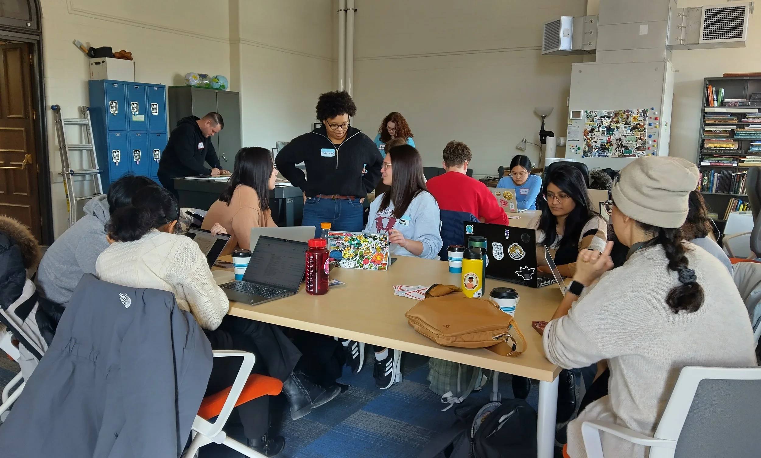
UWCL Design Challenge participants discuss their ideas with Kela Caldwell during the 2024 Design Challenge. Twenty-one students and staff participated, along with the event organizers: PhD students Gareth Baldrica-Franklin, Kela Caldwell, Alicia Iverson, Cart Lab Creative Director Alicia Cowart, Associate Faculty Director Bill Limpisathian, and Faculty Director Rob Roth.

For this year’s challenge, we partnered with PhD student Kela Caldwell on her dissertation project to decipher and historicize the term “race riot,” and specifically to think through ways of visualizing these historical events in a counter-narrative by examining African American newspaper archives. Kela had mentioned that she was inspired by Guerrilla Cartography’s approach to atlas creation and was interested in seeing what kinds of narratives could be revealed through a collective research and map-making process. So, inspired by Guerrilla Cartography’s Atlas in a Day, the UW Cart Lab’s 2024 Design Challenge was a full day of archival discovery and creative production culminating in a collaborative atlas of maps on this theme.

At the start of the UWCL Design Challenge, participants chose the themes and locations they would map by placing a sticky note on this map projected on the wall, made by Gareth Baldrica-Franklin, of data compiled from African American newspapers.

While the event itself and resulting atlas were different from GC’s AIAD challenges in several ways, the UW Cart Lab’s 2024 Design Challenge demonstrates the relevance, utility, and adaptability of Guerrilla Cartography’s efforts to promote and expand the “art, methods, and thematic scope of cartography.”

Guerrilla Cartography’s next Atlas in a Day Challenge will be associated with the NACIS (North American Cartographic Information Society) annual conference in Tacoma, Washington in October 2024. As a Guerrilla Cartography-hosted challenge, we will reveal the single-word theme for the atlas approximately 24 hours before the end of the event and publish the atlas at the end of the day. While the details are still being sorted out as of this writing, we look forward to collaborating with both novice and seasoned guerrillas alike to create the newest Atlas in a Day!

Alicia Cowart is a long-time Guerrilla Cartography board member.

How AI is changing cartography: A chatbot’s perspective

Artificial intelligence is dramatically changing the practice of cartography, not just as a mechanism for extracting and manipulating data, but as a tool for creating, curating, and interacting with geospatial images. A simple web search for “AI in cartography” points to a vast number of articles, examples, and website resources—reflecting just how embedded in the practice of cartography this relatively recent technology has become.

With so much information about AI in cartography already online, I thought it might be interesting to see how an AI-driven chatbot (specifically, ChatGPT 3.5) would summarize the state of the field. The prompt I submitted to ChatGPT requested that its output take the form of a blog post for the Guerrilla Cartography website. Even if that website wasn’t included in the chatbot’s training, it was surely familiar with the blog post as an internet genre.

The ChatGPT-authored blog post on AI in cartography is reproduced here, unedited. Unsurprisingly, given how far chatbots have progressed in the past few years, the response is grammatical, well-organized, written in a breezy style, and seemingly comprehensive, but also somewhat generic. Examples and illustrations would certainly help, so I asked a few follow-up questions to flesh out the chatbot’s overview—with mixed results, as you can see below.


You

Write a 1,000 word blog post for the Guerrilla Cartography website on how AI is changing cartography.

ChatGPT

Title: The Cartographic Revolution: How AI is Transforming Maps

In the ever-evolving landscape of cartography, a silent revolution is underway. It’s a revolution powered by artificial intelligence (AI), reshaping how we perceive, create, and utilize maps. Gone are the days of manual charting and static representations. Today, AI is at the forefront, driving unprecedented advancements in mapping technology. From automated feature extraction to real-time updates, personalized navigation, and environmental monitoring, the impact of AI on cartography is profound and far-reaching.

The Rise of Automated Mapping

At the heart of AI’s influence on cartography lies its ability to automate previously labor-intensive processes. Imagine a world where maps are no longer painstakingly hand-drawn but instead crafted with precision and efficiency through AI algorithms.

Feature Extraction:

AI algorithms can now scan satellite imagery with remarkable accuracy, identifying and extracting features such as roads, buildings, rivers, and more. This means that what used to take weeks of manual tracing can now be accomplished in a fraction of the time, allowing cartographers to focus on higher-level analysis and interpretation.

Land Use and Cover Mapping:

One of the most impactful applications of AI in cartography is in land use and cover mapping. By analyzing satellite data, AI can classify different types of land cover, from forests to urban areas, with impressive detail. This not only provides valuable insights into our changing landscapes but also helps in urban planning, agriculture, and environmental conservation efforts.

Accuracy Redefined

AI not only accelerates mapping processes but also enhances the accuracy and reliability of the resulting maps.

Quality Control:

With AI’s keen eye for detail, errors in maps can be quickly identified and rectified. Inconsistencies in data, such as mismatched road networks or misplaced landmarks, can be automatically flagged, ensuring that maps are as precise as possible.

Data Fusion:

By seamlessly integrating data from multiple sources—satellite imagery, GPS, aerial photos—AI produces maps that are more comprehensive and up-to-date. This fusion of data leads to richer and more detailed representations of our world.

Real-Time Updates and Dynamic Maps

The days of static, outdated maps are behind us. AI enables the creation of dynamic maps that reflect the ever-changing nature of our environments.

Real-Time Monitoring:

Whether it’s monitoring traffic conditions, tracking weather patterns, or responding to natural disasters, AI-powered maps provide real-time information crucial for decision-making. Emergency responders can rely on these dynamic maps to navigate evolving situations with precision and speed.

Crowdsourced Data Integration:

AI is also adept at processing and integrating crowdsourced data from platforms like OpenStreetMap. This means that community-contributed updates, such as new roads or points of interest, can quickly find their way onto official maps, ensuring that they are always current and relevant.

Personalized Mapping Experiences

AI doesn’t just stop at creating maps—it’s also revolutionizing how we interact with them on a personal level.

User Behavior Analysis:

By analyzing user preferences and behaviors, AI can tailor maps to individual needs. Whether it’s suggesting optimal routes based on past travel patterns or highlighting points of interest aligned with a user’s interests, maps become more than just navigation tools—they become personalized guides.

Contextual Mapping:

Maps can now adapt to the context in which they are used. Factors such as time of day, weather conditions, or nearby events can influence how a map is displayed. For example, a map might highlight nearby cafes in the morning and restaurants in the evening, providing a seamless and intuitive user experience.

Visualizing the Future

The visual appeal of maps is also undergoing a transformation, thanks to AI.

Style Transfer:

AI can apply different styles to maps, allowing users to choose between classic, watercolor, or even futuristic renditions. This not only adds a layer of aesthetic appeal but also serves practical purposes, such as optimizing maps for specific audiences or purposes.

3D Mapping:

With AI, we are witnessing the rise of detailed 3D maps that offer a new perspective on our world. Whether it’s visualizing urban landscapes or exploring natural terrain, 3D maps provide a richer and more immersive experience.

AI for Environmental Monitoring

The power of AI extends beyond just human landscapes—it’s also making a significant impact on environmental mapping.

Change Detection:

By comparing satellite images over time, AI can detect changes in vegetation, water bodies, and urban areas. This capability is invaluable for environmental monitoring and conservation efforts, allowing us to track deforestation, monitor wildlife habitats, and respond to ecosystem changes.

Habitat Mapping:

AI’s ability to analyze satellite imagery is instrumental in mapping habitats for various species. Conservationists and researchers can use these maps to identify critical areas for protection and better understand the interconnectedness of ecosystems.

Navigating the Future with AI

The influence of AI on cartography is undeniable, but it also presents challenges and considerations.

Data Privacy:

As AI relies heavily on data, concerns around privacy and data security are paramount. Safeguarding personal location information and ensuring transparent data usage practices are essential.

Algorithm Bias:

AI algorithms are not immune to biases present in the data they are trained on. This can lead to inaccuracies or unfair representations in maps, highlighting the importance of diversity and inclusivity in data sources.

Technical Challenges:

The processing of vast amounts of geospatial data requires powerful computing resources and efficient algorithms. Continued advancements in AI technology will be crucial to overcoming these technical hurdles.

Embracing the Cartographic Revolution

In conclusion, we are witnessing a cartographic revolution driven by AI—a revolution that is reshaping how we map and navigate our world. From automated mapping processes and enhanced accuracy to real-time updates, personalized experiences, and environmental monitoring, the possibilities are endless.

As we continue to harness the power of AI in cartography, it’s essential to remain vigilant about data privacy, algorithmic biases, and technical challenges. By addressing these concerns, we can fully embrace the potential of AI to create maps that are not just informative tools but also works of art that inspire, educate, and empower us to explore the world around us.

The future of cartography is here, and it’s powered by AI. Let’s embark on this journey together, charting new territories and discovering the boundless possibilities that lie ahead.

You

Add three examples or images that illustrate the main points of this blog post

ChatGPT

Certainly! Here are three examples or images that illustrate the main points of the blog post on how AI is changing cartography:

1. Feature Extraction: Before and After AI

Image Description: A comparison between manually identifying features in a satellite image (left) versus AI-automated feature extraction (right). The AI-automated process shows clearly identified roads, buildings, and water bodies with labels.

  • Caption: AI-powered feature extraction drastically reduces the time and effort required to identify and map features such as roads, buildings, and water bodies. The image on the right demonstrates the efficiency and precision of AI in extracting these features from satellite imagery.

2. Real-Time Updates: Dynamic Traffic Monitoring

Image Description: A dynamic map displaying real-time traffic conditions with color-coded lines indicating congestion levels on roads.

  • Caption: Real-time updates powered by AI enable dynamic maps like this one, which shows live traffic conditions. Color-coded lines represent varying levels of congestion, providing users with up-to-the-minute information to plan their routes efficiently.

3. Personalized Mapping: User Behavior Analysis

Image Description: A personalized map displaying suggested points of interest based on the user’s preferences and past travel patterns.

  • Caption: AI analyzes user behavior and preferences to create personalized maps. In this example, the map suggests points of interest based on the user’s past travel patterns, enhancing the user’s experience by providing relevant and tailored information.

These visual examples complement the main points of the blog post, showcasing how AI is transforming cartography through feature extraction, real-time updates, and personalized mapping experiences.

The Chatbot’s Limitations—for now

This small experiment demonstrates that ChatGPT can produce a reasonable overview of AI’s impact on cartography—and is likely just as fluent with any other subject included in its online training. For a blog post, though, there should really be more specific examples, which is why I submitted a follow-up request. The examples were interesting, but lacked images because ChatGPT’s current public version is only text-based. Since the chatbot’s examples might have been based on actual online images, I requested their URLs. ChatGPT was happy to comply, but the links led nowhere. Thinking that the links might have expired, I looked for the images on the Internet Archive’s Wayback Machine, but the images weren’t found there either. Most likely, the images were chatbot “hallucinations.”

Google’s chatbot, Gemini (formerly Bard) is a ‘multimodal’ chatbot that is trained on images as well as text. So I tried a similar exercise there, asking for specific examples and images. Gemini produced a similar text and some map images, but they weren’t very helpful. They didn’t illustrate how AI might have been involved in creating the map, and they didn’t relate well to the text—almost as if they were selected at random from a collection of maps.

But chatbots are improving rapidly. More capable versions are being introduced every few months, so it won’t be long before multimodal chatbots with advanced image analysis capability can go beyond the limitations we see today. Whether the results are interesting and useful is something that humans will still have to decide.


Charles Drucker has been a Guerrilla Cartography board member since 2019.

How Guerrilla Cartography’s Atlases Promote Diverse Perspectives

Guerrilla Cartography aims to promote the understanding that there are many views of the world, that how we understand space and place can vary, and that we should think critically about the maps and the graphics we make and consume. Our organization has designed processes for creating our atlases that support these goals.

1) By Featuring Diverse Narrative Viewpoints

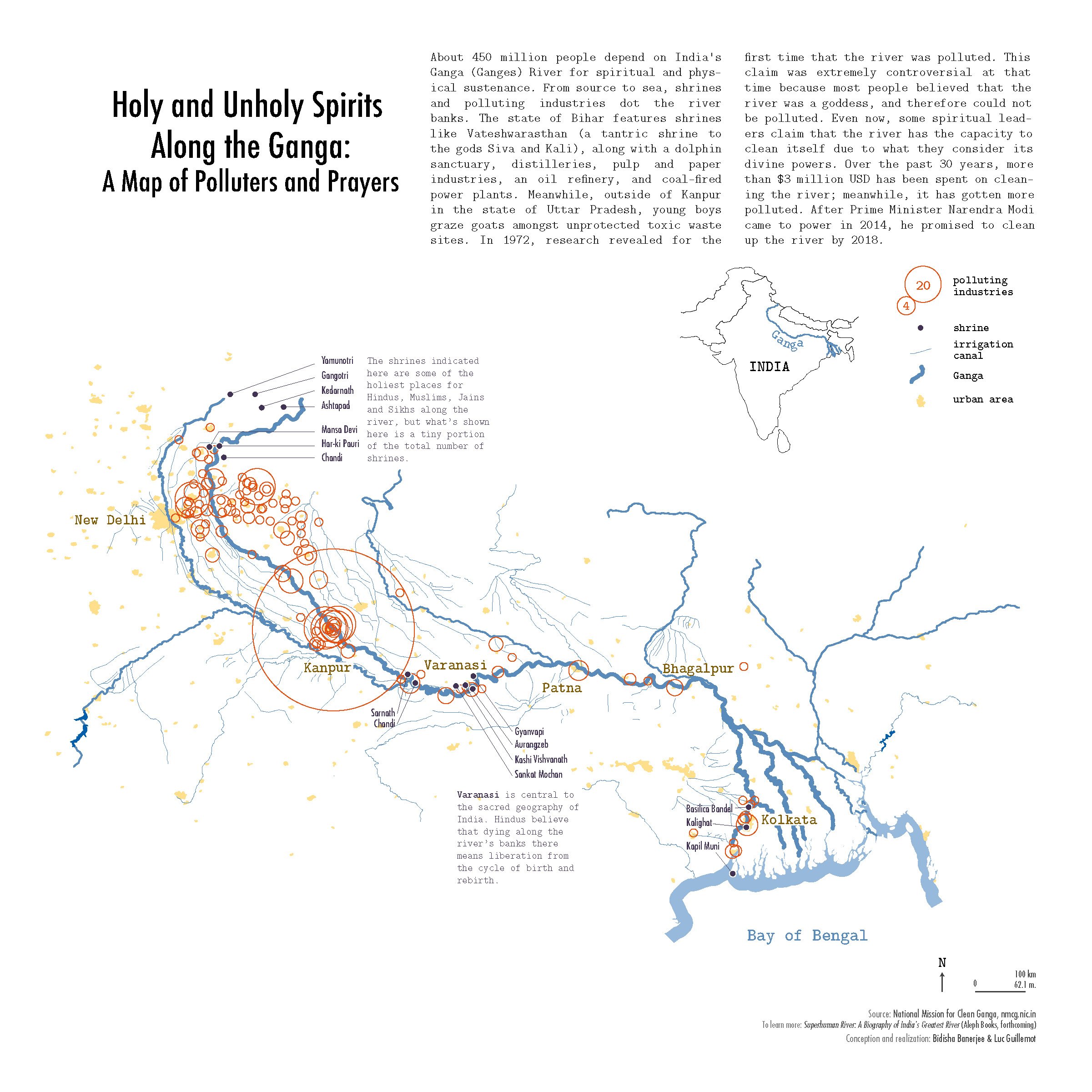
A different person or group of people produced nearly every map in our atlases, each contributing their indi­vidual aesthetic and experiences to the broad theme. We can never tell all stories about food or water, but crowd­sourcing content allows us to glimpse a few things that we might not otherwise encounter, giving the atlases a variety of perspectives. An example of an unusual narrative viewpoint is the map “Holy and Unholy Spirits Along the Ganga: A Map of Polluters and Prayers,” which juxtaposes spiritual sites with polluting industries along the Ganga (Ganges) River in India. This map was a collaboration between social ecologist Bidisha Banerjee and cartographer Luc Guillemot for Water: An Atlas.

Holy and Unholy Spirits Along the Ganga: A Map of Polluters and Prayers by Bidisha Banerjee and Luc Guillemot in Water: An Atlas (2017).

The atlases also exhibit a variety of literal viewpoints, including different projections and scales. One example is Garrett Bradford’s map of “Global Almond Trade and California,” featured in Food: An Atlas.

Global Almond Trade and California by Garrett Bradford in Food: An Atlas (2013).

The central map employs the unusual Peirce quincuncial projection in order to place California at the bottom, so as to better showcase the almond trade that emanates from it. The cartographic choices highlight the narrative of California as the center of global almond production.

2) By Placing Maps in Relationship to Other Maps and Information

The atlases are meant to be both informational and entertaining, readily accessible to anyone with an interest in maps, in the theme, or both. After the call for maps is sent out, the maps that the crowd chooses to make end up creating a narrative for the atlas. We do not prescribe the narrative in advance; it grows organically throughout the process of building the atlas. We are then able to group the maps into narrower themes within the broad theme, giving a structure that makes the atlas more than simply a collection.

This is the part of the atlas that is editorial, and that makes the board a part of each map and its story. While each map by itself has a story, that story also becomes contextualized in the order of the maps. We experiment with multiple linear “stories” as we work to pull the narrative thread through the atlas. There are other stories that can be told with these maps and other ways they could be grouped, but due to the constraints of producing a physical atlas, the editorial board decides the final grouping and order for the maps. We hope our arrangement of the maps provokes a response in readers, prompting them to agree with or question the narrative that is being told, and to translate that to their viewing of other maps and atlases.

3) By Building Legitimacy for Marginal or Atypical Cartographic Voices

Among other things, Guerrilla Cartography is concerned with authority — the authority of who gets to produce and distribute maps and why. The narrative construction of the atlas and the editing process itself both help give legitimacy to voices that may not have access to traditional atlas or map publishing venues. Our process of pairing people who have map ideas with our volunteer cartographers is another way that we make space for many different viewpoints, such as the collaboration mentioned above for “Holy and Unholy Spirits Along the Ganga.” Banerjee had been immersed in a project about the Ganga since 2009; after submitting her idea to the Water: An Atlas call for maps, we connected her with Luc Guillemot, a Guerrilla Cartography volunteer. They worked together over email to bring Banerjee's vision to life.

Seeing the ways that a variety of people represent geographic data is informative and instruction­al. While anyone can publish maps that they have created on the Internet, distribution may be limited. Without a digital home, these maps may also disappear. Guerrilla Cartography’s atlas publishing model enables a broader audience and a more concrete presence-both digital and physical. The crowd­sourced nature of Guerrilla Cartography’s atlases also helps viewers critically examine their assumptions of who has the authority to produce maps.

4) By Promoting Critical Evaluation of Content, Authorship, and Authority

The myriad styles, narratives, and scales of the maps contained within Guerrilla Cartography’s atlases invite readers to question their assumptions about how a map is constructed, by whom, and for what purposes. The atlases also encourage readers to think critically about the very data that the map representations are constructed upon. For instance, in Water: An Atlas, we open with a chapter titled “Imagination.” Here we are mapping imaginary data, or in some cases actual data on imaginary or legendary phenomena. The map “North American Water Tensions in the Year 2028,” for example, depicts a dystopian vision of water scarcity-caused conflicts in the not-too-distant future.

North American Water Tensions in the Year 2028 by Bryce Touchstone and Melissa Brooks, in Water: An Atlas (2017).

For someone to read these maps, they must begin to understand that, while the map portrays a certain authority, the mapped data may not exist in the real, tangible world. Unreal data are being mapped. What does that mean for all the maps we see? Does it make us wonder about the “real” data that are being mapped elsewhere in the atlas?

Alicia Cowart and Susan Powell are members of Guerrilla Cartography’s Board of Directors. An expanded version of this article was first published in Cartographic Perspectives, Number 92, 2019.

Interculturality as Shelter

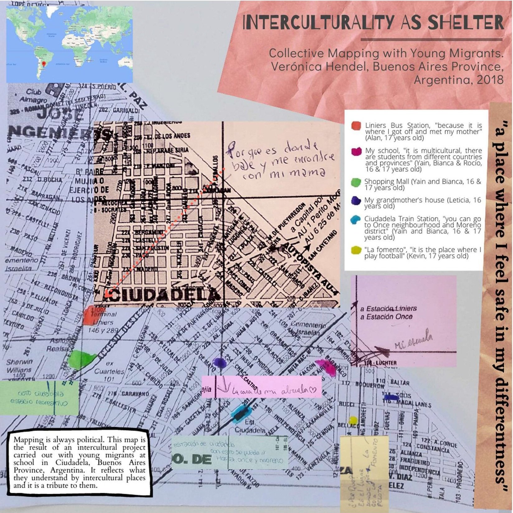
Interculturality as Shelter is a map made of many maps. It examines the ways in which young migrants experience interculturality in the neighborhood where their school is located. It shows their ways of feeling, walking, and making the city.

A neighborhood where nobody cares

Ciudadela is a town located in the southern part of the Buenos Aires province district of Tres de Febrero, Greater Buenos Aires, Argentina. It is a place of passage, circulation, trade, and exchange. Located halfway between one of the most important train stations and bus terminals in Buenos Aires City, and the train station that bears the name of the neighborhood (located in Greater Buenos Aires), Ciudadela unfolds as a diverse, heterogeneous, unequal, and insecure space. A territory that is home to many others: Ciudadela Norte, Ciudadela Sur, Villa de los Paraguayos, Fuerte Apache, Villa Herminia, Villa de los Rusos, and Villa Matienzo, among others. Places that bear ethnic, class, race, and national marks in their names that refer us to historical formations of otherness.

As young people themselves point out, they “come from many trips.” Mobility takes place in the context of family migration, involving multiple movements between countries (in general, Bolivia and Argentina, but also Paraguay and Peru), provinces, cities, and/or neighborhoods. The multiple mobility experiences of these young people are, in turn, experiences of diverse territories and multiple border crossings, an extremely relevant aspect when reconstructing and analyzing their experience of the city.

“Why is our neighborhood dangerous? Why can’t we walk without feeling fear? How did the neighborhood come to be what it is?” are some of the questions that young people framed in the context of an ethnographic and collaborative work experience carried out in a secondary school in Greater Buenos Aires (Argentina) between 2018 and 2019.

In this sense, displacement cuts across this map in various ways. First, as a way of inhabiting, traveling, and “making” the city of the young people with whom we worked. Second, as a broader repertoire in their experiences of multiple territories linked to the migrant condition of most of them. Finally, as an activity or operation subject to control or “government” by the State, and specifically by security forces in urban space.

Interculturality as Shelter shows the backside of this experience of the city as danger. Interculturality is a complex term that young people were debating at school in the context of a broader project. When I asked them what they meant by it, words such as “respect,” “tolerance,” and “cultures” emerged. When I told them about the idea of mapping interculturality, new aspects came to light: political and affective dimensions that were not visible before. It was the first time they carried out such a mapping experience.

Taking an official map as a departure point was a limit but also a good opportunity to point out the tensions between their lived experience of the city and the one cartographers took into account. It was hard for young people to place themselves into the maps and find those places they linked to interculturality. Most of them worked in small groups but others preferred to do it individually. Part of my challenge in doing this map was to turn the eight maps I received into only one.

Three of the eight maps that were combined into the final map.

Mapping is always political

Far from notions such as tolerance and respect, when mapping, young people link interculturality to places where they feel safe among others, such as friends and relatives. Places where they feel safe in their differentness.

The production of other cartographies and maps enabled the creation of spaces for dialogue and the production of collective knowledge about the experience of the city. Reflection from a visual device allowed the articulation of ways of experiencing the city and narratives that dispute, and challenge hegemonic urban perspectives.

The Interculturality as Shelter map appeared in Shelter: An Atlas, published by Guerrilla Cartography in March, 2023.


TRANSitar Lima

THE RIGHT TO THE CITY: Who has the right to move freely through the city and who doesn’t?

Map of Lima, Peru

About the project

TRANSitar Lima is a project that seeks to create a visual record of transphobic violence, based on collective mapping sessions. Trans, transvestites, and non-binaries* who participate identify the specific points of the city where they have experienced violence or where their exercise of citizenship has been violated, through drawing, collective mapping, and body mapping.

Detail of an art Installation depicting the mapping project

To transit the world

Historically, transvestites, trans, non-binaries, and gender dissidents have been seen as abject under the colonial regime, denied and minimized in official history. As identities and bodies that escape the regimes of the cis-tem, we are constantly in situations of vulnerability, we move through a city that excludes us and violates us.

Detail of an art Installation depicting the mapping project

When experiencing structural violence on a daily basis, it is necessary to create, collect, and disseminate narratives that start from our own experiences and knowledge.

Goals

The main goal is to show the different types of violence that trans, transvestites, and non-binaries experience in metropolitan Lima, through collective mapping exercises and drawing.

The specific objectives are the following:

1.  Build a visual archive based on the territorial experiences of the participants who live and travel through metropolitan Lima, in order to make these problems visible.

2.  Generate spaces for reflection in relation to their transit through the city, based on the creation of their own narratives, emphasizing the importance of being able to build our own visual testimonials.

The project highlights the importance of artistic creation as a tool for criticism and reflection, but also for an action that questions the violence that is reproduced in the territory. During the first part of the project, collective mapping sessions were managed where one of the activities, for example, was to use maps on which we intervened (drawings and text) to recognize the places we travel in our daily lives and the violence that could occur or that we experienced there. In this way, the mapping serves as a visual resource to narrate our own experiences about the territory, to make us aware of the places we occupy.

Collective mapping session

Mapping sessions

The trans-collective mapping sessions propose that the participants use visual tools, such as drawing and mapping, to collectively rethink the spaces they inhabit and travel, locate on the map places where transphobia was encountered and re-appropriate the cartography tools to propose new maps based on experiences.

Collective mapping session detail

With this, it seeks to reflect on the experiences, memories, and problems that occur in these spaces. Thus, it is proposed that the visual format can be a support for the testimonies of violence. In this way, the mapping serves as a visual resource to narrate our own experiences about the territory, to make us aware of the places we occupy.

Collective mapping session detail

About the map

This map presents the data collected in the sessions in a visual and communicative format. The process to make this map was long and required lots of changes in order to improve the user experience. It’s important to remark that this map itself is part of the process of the whole project and represents the visual systematization of part of the collected data.

First draft of the map

*In the United States and in other regions, "transvestite" could be a pejorative term. But it is widely used in the Global South, especially to make a distinction between them and transgender people.


The TRANSitar Lima map appeared in Shelter: An Atlas, published by Guerrilla Cartography in March, 2023.

Shelter: An Atlas

Food, water, shelter. The tripartite of basic needs. Without these no living thing can survive. Not a spider, not a badger, not a tree, not a human. The first two — food and water — are obvious; without them, sustenance is impossible. The food we eat gives us energy through calories, vitamins, minerals, protein, fats, and carbohydrates. Water regulates our body temperature, cushions our joints, protects our spinal cord and muscles and cleanses our body. Food builds our bodies and water maintains them.

And shelter protects. Shelter buffers us from harsh elements — high heat, extreme cold, rain, snow, and wind. Shelter is also a home. A place to feel safe and to be safe.

One can live a few days without water and a few weeks without food. But how long can one live without shelter? Not as long as you might think. In fact, in an extreme environment like a frozen mountain top, one can only live for about three hours without shelter, rendering food and water useless.

It is not just the comfort of a rigid structure that allows some people to live longer than those that don’t have shelter. The unhoused have lower life expectancy, in part, because the stress, isolation, loss of dignity, and inadequate health care that comes with being unhoused and unsheltered can bring on physical and mental health issues that might never have developed if the person had been sheltered. Or, they develop the health issues they were destined for, but about twenty years earlier because those without shelter age faster in a phenomenon known as weathering — literally being worn down by weather. Not having access to adequate health care, these people succumb to diseases they might have managed or cured if they had a home.

Human shelter in its most basic form — a home — sustains life just like food and water do.

Community as shelter

When Guerrilla Cartography crowdsources an atlas, there is only ever a one-word prompt. Food. Water. Migration. Community. This is because we want our collaborators to have the freedom of thought to imagine the prompt as broadly and loosely as possible. Food gave us maps as diverse as A Tomato’s European Tour and Threats to Indigenous Food Traditions in North America. Water gave us maps about Managing Shared Waters in the Nile Basin and Locating Atlantis.

Shelter, of course, inspired maps about housing and the lack of housing, as well as pandemic sheltering in place. But it also brought us maps about tax shelters, emotional shelters, and an imaginary map: The Rhizosphere, a shelter for microorganisms.

With the shelter atlas in process since the summer of 2019, Guerrilla Cartography devised the scheme of building an atlas in just one day. We had proved — with Food: An Atlas — that we could build an atlas in a few months. The food atlas went from idea to a printed volume in about seven months. We had similar aspirations for the water atlas but it ended up taking much longer because of the sudden death of my husband. We aimed to get back on the fast track of atlas production with shelter. And we were. Until the pandemic.

On October 5, 2019, the subject of the first Atlas in a Day project — migration, broadly defined — was announced via live stream at 9 pm PDT, Friday night. The following day, some 35 collaborators met at Oakstop in Downtown Oakland, California, and began sharing ideas and working on maps. We had guest speakers and shared a meal and we collaborated. Another 28 challenge participants worked on their maps remotely, representing nineteen other locations in four nations. Creating on computers, paper, and boards; using ones and zeros, crayons, watercolors, embroidery thread, and other media; the challenge collaborators submitted 43 maps by the 7:30 pm map deadline with subjects like Patterns of Involuntary Migration and Migration of the Word ‘Honey.’ A single electronic file was compiled and one rough print on a scrappy printer was attempted by 9 pm, fulfilling the challenge.

All of our atlases (like all maps and atlases) show us a picture or story of the time they were created. The shelter atlas came along, ironically and coincidently, at a time when shelter was top of mind for everyone on the planet as we sheltered against an invisible pathogen, SARS-CoV-2, the coronavirus that causes COVID-19. The Guerrilla Cartography board decided on the theme of shelter in the summer of 2019 and announced the call for maps in February of 2020, about three weeks before it became clear that everyone should take shelter against the virus by staying home — from school, from work, from every activity that usually had us moving about in the world.

During the first weeks of the pandemic lockdown and with a proof of concept for Atlas in a Day published, plus Shelter in the works, we decided to create another Atlas in a Day event to help us (and the whole Guerrilla Cartography community) deal with the social and professional isolation that was sinking into our collective psyche. By necessity, this would be a wholly virtual event. We settled on a theme — community — and set to work creating a program. We had speakers from New Zealand, Germany, England, Argentina, Massachusetts, Arizona, Utah, Montana, Washington State, Berkeley, and Oakland. Hosted from our homes (for me, the makeshift workstation in my bedroom), we built community across the virtual divide. Together apart, from twelve nations and nine U.S. states, we created 44 maps, including: My Parallel Communities of Chiang Mai, Viral Creativity: COVID-19 Murals on Seattle Storefronts, and Fishing Communities of the Tonlé Sap are Under Threat.

Shelter: An Atlas is is currently in press and will soon be available for distribution and free download. In this volume, Guerrilla Cartography expands a community of cartographers, researchers, and designers, expands the community of map readers and knowledge seekers, explorers of ideas. All fulfilling Guerrilla Cartography’s founding ideal that a “new paradigm for cooperative and collaborative knowledge caching and sharing could have a transformative effect on the awareness and dissemination of spatial information.”

Our collaborators share their geographic knowledge, talents, and inspirations; through their maps they shed light on the inequalities inherent in definitions of race, gender, economics, habitat, environment, and climate. These maps describe experiences and phenomena of privilege or lack of privilege. Shelter, in whatever context, is an attribute of privilege. Together, we share these maps in the spirit of community, that all may find shelter.

What a GIS & Map Librarian does all day

The two most common responses I get when I tell people that I’m a map librarian at UC Berkeley are:

  1. I didn’t know that was a job?! and

  2. I love maps!

These are both fair reactions. It’s not a very common job. And maps are very cool. Just like a typical librarian’s work does not involve sitting around reading books all day, though, my job is much larger than just looking at fun maps all the time. The core of my work is actually helping people understand maps better so that they can use and create them. I help everyone from researchers looking at the historical extent of kelp beds along the California coast, to students seeking air quality data in Oakland for their class project, to local residents investigating a property dispute.

My official title is “GIS & Map Librarian” and I have the good fortune to work with great people and wonderful materials. The UC Berkeley Library has one of the largest map collections in California, with around half a million print maps and aerial photographs. The map collection is part of the Earth Sciences & Map Library, which occupies a good portion of the ground floor of McCone Hall near the north side of UC Berkeley’s campus. Due to the odd layout of the library, you have to explore a bit to find the map room, but once you do, you are in for a treat!

UC Berkeley Earth Sciences & Map Library (Photo by Samantha Teplitzky)

The maps in the library’s collection were produced mainly in the 1900s and onward. They are a visual feast and run the gamut from rainbow-colored geological maps to evocative real estate advertising maps to, well, even a map of Sasquatch sightings!

Each map tells many stories: what is conveyed by the data and design, but also the stories of the people who created it, their audience, and the era it came from.

New perspectives on old maps

Sometimes — often — researchers use maps in the library’s collection for purposes which they were not originally intended for. A few years ago a scientist studying California’s kelp used 150-year-old nautical charts from our collection to try to determine where and how big the kelp forests had been in the past. These nautical charts were created by the US government to help guide boats around the coasts and prevent shipwrecks. Mapping the kelp beds made navigation safer, but the cartographers were not interested in kelp’s ecosystem role. Today that information about historical kelp is critical to understanding the past, so that we can make better predictions and choices about the future.

Kelp beds near Santa Cruz, California, shown on 1891 nautical chart

One big project that my library is working on right now has a similar goal of making a collection of historical maps available online for people to use in new ways: maps that were captured from the German military at the end of World War II and redistributed to university libraries across the United States. UC Berkeley has about 20,000 of these maps, which show detailed views of pre-WWII Europe. I am leading a project to describe and digitize the collection, which we’re making available online as we work through the maps (20,000 is a lot!). We are excited to see what people do with the maps — including genealogists, military historians, geographers, and uses we haven’t even thought of yet!

Captured German map

Stamp on a captured German map

Using maps and data

There are many different ways that I try to help people work with and understand maps and geospatial data. Most directly, I consult one-on-one to learn more about their particular questions and help them find the maps, data, or tools they need. I also teach workshops about how to get started with finding geospatial data and creating digital maps. Whenever I talk with people about maps and geospatial data I try to emphasize that they are representations that need to be understood within the context in which they were created or generated. This is important for understanding how to use the maps and data.

It is also important for being able to find maps or data in the first place, and that is a lot of what people come to me for help with. For example, for those students interested in finding air quality data, there are a number of questions we might go through in order to help us find data that they can use for their class research projects.

Oakland air quality map, originally appearing in this article

Where? I know they are interested in Oakland, but do they have a particular neighborhood they are researching? Is it the whole city? Just areas along a freeway?

When? What is the time period that they want data for? Is it just the past year, or a time series of data over the past five or ten years? Do they want to see how the air quality varied throughout the day, or are daily averages okay because they are more interested in seeing how it changes seasonally?

What? Are there particular aspects of air quality that they are interested in? Do they want to map specific pollutants like ozone, or are they interested in particulate matter?

Who? Is there a government agency or private company that might have had an interest in collecting this kind of air quality data? Sometimes a general search can be less effective than finding data from a known source.

After answering all of these questions, I have a better idea of how to help the students find the data they need. And hopefully, the students have a better understanding of how to map and interpret their air quality data.

I love that I get to do so many different things in my work as a map librarian, and that they all relate back to helping people think about their world a bit differently. Really engaging with a map and/or geospatial data can give us a different perspective — literally!

Collection of globes in the map library (photo by Samantha Teplitzky)

Susan Powell is a map & GIS librarian, a Guerrilla Cartography board member, and a new mother (who has recently been re-acquainted with the world of Richard Scarry!).

Counter-mapping: Sitio San Roque, Philippines

This counter-map was the product of a collaboration between the Junior Philippine Geographical Society – University of the Philippines Diliman (JPGS-UPD), the Save San Roque Alliance, Kadamay – San Roque, and most especially the urban poor residents of San Roque.

The Beginnings

Counter-mapping has been the main methodology and practice of our organization, as it believes that the discipline of geography can be an effective tool in addressing pressing issues in Philippine society. The perceived concept of spaces as mere containers of different occurrences and phenomena is something that counter-mapping tries to transcend. Instead, counter-mapping is a highly political method that shows spaces as continually produced and engaged through processes centered around human influences. The participation of the marginalized sectors in the process of mapmaking, and in turn claim-making, is a very profound and fundamental part of counter-mapping. Counter-maps should always serve the interests of the marginalized. Mapping for the people is possible because there is mapping from the people.

Contour: Mapping for the People is a project that was first conceptualized during the fifth founding year of the Junior Philippine Geographical Society – UP Diliman (JPGS-UPD ) as spearheaded by its Sociocultural Activities Committee. With its commitment to bring the discipline closer to the people, the Contour project is aimed at providing an avenue for the discussion about space, power, discourses of development, and land dispossession. Alongside such discussions, the project also concerns itself in engaging in these contested spaces, and to understand the people’s everyday experiences.

Our organization, JPGS-UPD, held its first Contour project in Sitio Buntog, Barangay (Village) Canlubang, Laguna, where Hacienda Yulo is located. Its main objective was to reach out to the sugarcane workers, who were working in lands that are privately owned by the Yulo family, and personally learn from their stories.

In the following year, JPGS-UPD went to one of the most controversial haciendas in the Philippines — Hacienda Luisita in Tarlac province. A series of counter-maps were created, aimed at generating further discussions about peasants’ and workers’ conditions in agricultural production and the failed promises of agrarian reform in the country. In 2018, Contour brought us to Pandi, Bulacan. Pandi is a second-class urban municipality in the province of Bulacan and is home for various idle and substandard housing projects of the National Housing Authority (NHA). One of these housing projects, called ‘Atlantika,’ is located in Barangay Mapulang Lupa, Pandi, Bulacan. These housing units were occupied by the members of the urban poor group, KADAMAY (Kalipunan ng Damayang Mahihirap, Federation of Mutual Aid for the Poor), because of the decades of neglect from the Philippine government.

After four Contour projects, we decided in 2019 to launch Contour: ‘Balik-Tanaw,’ which translates to ‘in retrospect.’  The idea behind this spin-off is to revisit the communities we had engagements with in the past and update the outputs we left in the community. This is also motivated by our belief that as budding scholar-activists, we need to always reflect and enrich our own praxis in conducting research with communities by building meaningful relationships and standing in solidarity with them. It is also a way to instill in our new members the understanding that research should not be extractive, it should not reinforce existing power relations, and it is not partial or neutral.

Official social media poster of Contour: Balik-Tanaw.

The Community

Sitio San Roque is a self-built, urban poor community that sits on public land in North Triangle, Barangay Bagong Pag-asa, Quezon City. At its peak, it was home to an estimated 17,000 families, who mostly migrated from rural to urban areas after the fall of the dictatorship of Ferdinand Marcos in 1986. This is often referred to as the EDSA Revolution, because so many protesters assembled on one of Manila's main avenues, Epifanio de los Santos, or EDSA. Over the years, the number of families living in the community has dwindled down as manifestations of neoliberal urban development slowly encroach on the area. Particularly through Executive Order 620-A, signed by former President Gloria Macapagal-Arroyo, with the support from the World Bank, which authorized the construction of Quezon City Central Business District (QC-CBD). This project was envisioned to transform northern Metro Manila to be “globally competitive and be the center of gravity of all commercial activities.”

For the QC-CBD plan to materialize, the National Housing Authority, together with the Quezon City Local Government Unit, entered a public-private partnership with the private realty developer, Ayala Land Incorporated. More specifically, a joint venture was formalized in 2009 and was unveiled to the public in 2012. This commercial and business hub will be comprised of high-end residences, malls, business offices, entertainment parks, and other facilities. Part of the masterplan is the newly constructed mixed-used building, Vertis North by Ayala Land, and the ongoing Solaire North, a resort and casino by Bloomberry Resorts Corporation.

This development project meant militarization and surveillance, forced evictions, violent displacement, and terrorist-tagging for the thousands of urban poor families living in San Roque. Private developers have used various tactics to intimidate the residents and fragment the community, so they would eventually accept resettlement to far-flung areas. It was in 2010 when a large-scale demolition happened and it wasn’t the last.

“With the lapsing of another seven-day demolition notice, hundreds of residents led by Kalipunan ng Damayang Mahihirap (KADAMAY) barricaded Agham Road and EDSA and violently clash with a team of 600 police personnel, firemen, and volunteers. The stand-off lasted six hours, causing a massive traffic jam on EDSA and resulting in at least 18 injuries.” (Quoted from San Roque Primer written by Save San Roque Alliance.)

Due to the widespread media coverage of the 2010 incident, the strategy of NHA-Ayala shifted to “voluntary” and “pocket-sized” forced demolitions. They also became “creative” in uprooting the residents from the community. Strategies such as bribery, trumped up charges, arson, and destroying community relations through infiltration and cooptation of grassroots organizations were utilized.

Despite these attacks, the urban poor of Sitio San Roque are firm in their stand to struggle for their right to the city through their Community Development Plan (CDP).

“The CDP is a counterproposal that allows urban poor communities to build capacity and confidence, to create a stronger platform allowing communication with authorities and with a broader audience, to allow sidelined citizens to be part of the city’s development and to be involved in determining their living environment. This is a product of collaboration, consultations, and community planning between Sitio San Roque residents and the Save San Roque Alliance,” (Quoted from Save San Roque Primer written by Save San Roque Alliance.)

Balik-Tanaw: Sitio San Roque

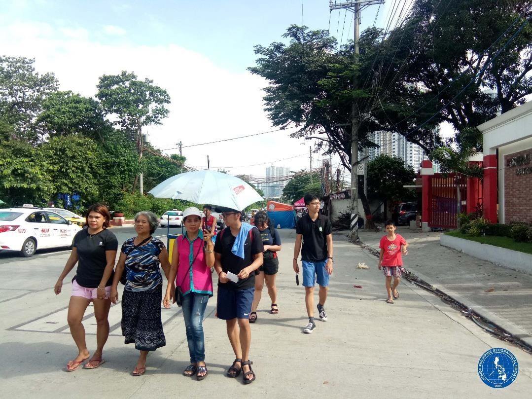
An integration to the community was conducted prior to the actual field visits of our members. This is to establish familiarity and rapport between the locals before doing any activities related to research. During the integration, we participated in two activities, an educational discussion about the situation of the urban poor sector in the Philippines and the case of Sitio San Roque, and a community tour led by the Nanays (mothers).

 To create the counter-map we conducted a participatory mapping activity and key informant walking interviews in different sessions. Firstly, in the participatory mapping activity, we were joined by the community members such as the youth, mothers, and even the elderly. They were grouped according to their length of stay in the community.

Group photo after the integration and community tour hosted by the members of Kadamay-San Roque and volunteers from Save San Roque Alliance.

Then, they were asked to plot in a base map, printed on a tarpaulin, their everyday spaces by recounting and retelling their personal experiences and stories in their struggle for urban housing justice. The activity mapped out the lost and existing communal spaces within the community. The counter-map was later used to campaign for on-site housing and development through their Community Development Plan (CDP). 

Residents collectively recalling their shared and lived experiences in Sitio San Roque.

Secondly, key informant walking interviews were facilitated to enrich the results of the participatory mapping activity. We utilized GPS technology to record the location data of the significant places marked by the residents themselves. In addition to taking the coordinates, we also took photos of the identified places for visual representation.

The significant places and markers around the community according to the residents.

JPGS-UPD members together with Ate Alma (resident) checking their list of significant places.

Lastly, educational materials such as a primer and a photobook were produced to further highlight the struggle of San Roque residents. The Quezon City Central Business District Primer (QC-CBD Primer) is a publication documenting the background and history of QC-CBD as a development project, exposing the framework of development — neoliberal urban planning and development — being used by the Philippine government, and emphasizing the active resistance of Filipino urban poor to the development aggression perpetuated by these pseudo-development projects. Also, a photo collection taken by the residents themselves was produced, depicting their everyday lives and to dispel notions that the urban poor are dependent, indolent, and nothing but thieves. The materials may be accessed here:

issuu.com/jpgs_upd.  

JPGS-UPD members conducting key informant walking interviews with Ate Alma, Nanay Inday, and teacher Anne.

From Our Southern Border to a Cottonwood Tree

I am an artist and not a trained cartographer. Because my work or message is often about the environment, geopolitical issues, water, animal and human rights, I look for how I might highlight particular issues, and then draw a word picture to go with the visual message of the map. So my map-making process begins with language, conversation. I like to banter about the idea, and before I am consciously aware (but it seems to me after I realize my map conceptually) the feel of the map begins to emerge, and then the map begins to draw itself, but not, of course, without work. 

Southern U.S. border wall

I spend much time researching my idea, reading, and interviewing. I encourage others to tell me the shape my idea might take. All decisions are mine, so I pick and choose, letting the possibilities sway me. I understand my concept, the big idea, and the concept directs the rest of my map.

Camp Naco

I like to put pencil to paper, sketch, list the points or issues that I want to highlight or address. I especially want to understand my personal message, even if unwritten. I walk, hike, or drive with direction, with an area or idea in mind. I try not to focus on what I might find. When I realize I have found what I am looking for, I have arrived. I collect that information, and keep on looking until I have what I need to explain my map.

I then begin the search for what I consider a good base map for my reminder to the reader of ‘what is here now.’

Beginning of map idea, Naco to Bisbee

The art part of map making begins. I take my camera to the area I am contemplating mapping. If I happen to get good photos, or at least interesting images, I might use them to build the points on the map I want specifically highlighted; like a quilt, or a collage, I add them to the top of the base map, and as layers. This can sometimes take mad computer skills; for that, I get the help I need.

Trailer shelters

I want the language to be as clear as I am capable, and often that requires an editor. A good editor can help flesh out a thought, knows a good story, and can help clarify for the reader and the writer. I want the map to answer all of the questions I want answered and I want to be able to easily prove my map is honest. Maps are serious for me. I want the proof of my map and some of the questions I hope are asked to be answered when readers see the map. 

I search through my images, collecting a very few of the many that helped direct my map. I give words to each of the photos that will be shown. The final photo in my process journey matters, it decides the direction of the map. I choose to show the vultures’ home in a cottonwood tree as flexible, migrating as trees and birds do when faced with human interference.

The Cottonwood Tree in Bisbee

Homeless and Shelters in São Paulo

When I was looking at the homeless census maps, my curiosity was sparked and I started to wonder what other visualizations and cartographical explorations could be possible. I have a deep interest in censuses because I have been working specifically in a peripheral communities’ census as a researcher at the Institute of Advanced Studies of the University of São Paulo project: Democracy, Arts and Plural Knowledges[1] (DASP). This research experience, my current studies, and São Paulo having a rich and wide public dataset made me interested in doing more analyses. Considering this situation, I decided that for my contribution to Guerrilla Cartography’s Shelter atlas, I would explore the homeless censuses combining the other available datasets.

The census report had dot-density and heatmap web maps that allowed the reader to zoom in and out to see the information better. However, what other representations and data combinations for analog and digital maps would be interesting? These new representations should be communicative and engaging, so I referenced Jacques Bertin’s Semiology of Graphics, and Rosely Archela and Herve Théry’s Methodological Orientation[2] as guidelines. Jacques Bertin argued that the map should be intuitive and proposed a series of ways to represent a map according to the type of information. As I had been studying this representation method in my classes, I decided to apply it to the new maps. First, I started to work with the roads, from the municipality database GeoSampa, and the homeless information, which was a localization dataset.

The first attempt combined only the homeless population (aggregated by districts), the roads, and shelters in the city. However, the vacant households in the city were a piece of very relevant information. Many scholars and activists have criticized the housing market, policies, the great number of empty residences, and other buildings that could be converted into houses. It is estimated that there is a housing deficit of seven million units, while there are 5.5 million underutilized properties in Brazil.[3] The vacant households’ information can be obtained in the national census, but it does not express all the housing potential, which can be greater through commercial building conversion to residential, and social housing construction on vacant lands. There are some numbers on the housing potential, although these are related to specific areas, such as the city center. The vacant housing was the best information available, so I recalled my experience as a researcher at the DASP in which the Brazilian Institute of Geography and Statistics (IBGE) methodology was applied.

During a census, all the residences are registered and classified, whether they are a permanent residence or for occasional use, occupied or vacant, etc. The registrations of households and their conditions were collected at IBGE's system SIDRA, a statistical and geographical database. Throughout this process, it was necessary to express the households’ total and percentage, as well as the homeless and sheltered total. The map was divided by the households in an anamorphosis map, while the homeless would be in a more Cartesian map, with the shelters symbolized as proportional circles. To link these two maps, the vacant percentage choropleth representation was the common element.

Anamorphosis map of households

There was also racial information that could be represented. To explore that information, it was necessary to split the information into more maps, which resulted in the following maps. The representations had the homeless population, the shelter localizations obtained in GeoSampa, and the racial distribution by district.

Racial distribution of homeless

Breaking down the information permits us to visualize the distribution better, however, as the drafts were done, the racial spatialization did not contribute much to the current analysis. The fact that 51 percent of the population is black or pardo[4] is more important than its spatial distribution. This data would require further research and discussion to be relevant before being spatialized. Considering these drafts and what data was available, the final map focused on the total population while the racial information was placed in the map introduction.

After the Guerrilla Peer Review’s feedback, the final map results in an exercise to explore from the semiologics of graphics perspective, combining the homeless, sheltered, public shelters, and housing information. It does not end all the potentials and possibilities that other cartographers and researchers can explore. Some aspects stood out and emphasized the inequality of São Paulo on the map, while others that are not on the map are very relevant for context.

References:

[1] http://www.iea.usp.br/:pesquisa/catedras-e-convenios/catedra-olavo-setubal-de-arte-cultura-e-ciencia/democracia-artes-e-saberes-plurais

[2] Rosely Sampaio Archela and Hervé Théry, “Orientação metodológica para construção e leitura de mapas temáticos”, Confins [online], 3 | 2008, uploaded 23 June, 2008. URL : http://journals.openedition.org/confins/3483 ; DOI : https://doi.org/10.4000/confins.3483

[3] Fernandes, E., “Implementing the Urban Reform Agenda in Brazil: Possibilities, Challenges, and Lessons.” Urban Forum 22, 299–314 (2011). https://doi.org/10.1007/s12132-011-9124-y

[4] In Brazil's classification, pardo represents a mixed-race population (mostly Afro descendants). The pardo category is a complex issue and reflects racial and historical-social relations, perceptions, and identities. This discussion is made by some authors as José Luis Petruccelli in the IBGE’s book Características Étnico-Racias da População: Classificações e Identidades (Population ethnic-racial characteristics: classification and identities) and Edith Piza and Fúlvia Rosemberg’s USP Magazine article Cor nos Censos Brasileiros (Colour in the Brazilian Censuses).